

Responsive Design
Overview
During creation of this theme I had to make a number of decisions regarding new elements positioning, behaviour and responsiveness.
I'm going to document some of them here so you'd know what's expected and what can be considered a bug.
Default Ghost Templates and Pages
The default Ghost templates (Narrow, Default, Full, No Image) as well as the Pages with Outline enabled via the use of #chapter-outline-show tag both share the same responsiveness approach.
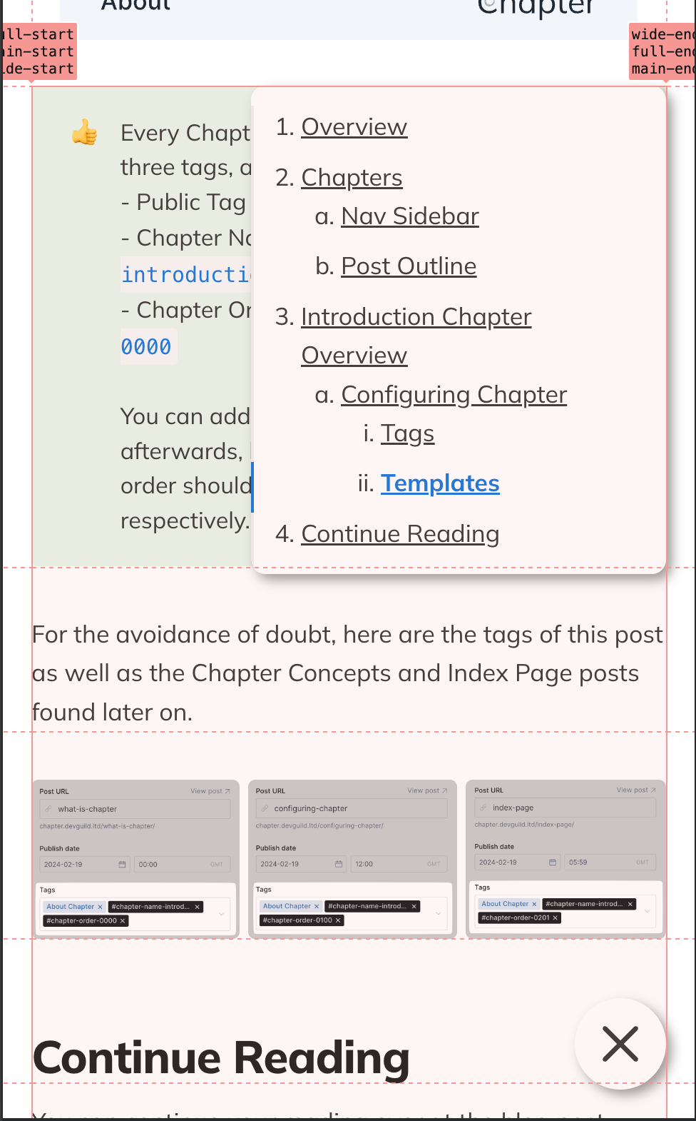
Extremely Large viewports - 1992px and more
On such devices we're aiming to make the most of the screen space, whilst fully respecting the Wide and Full content embeds.
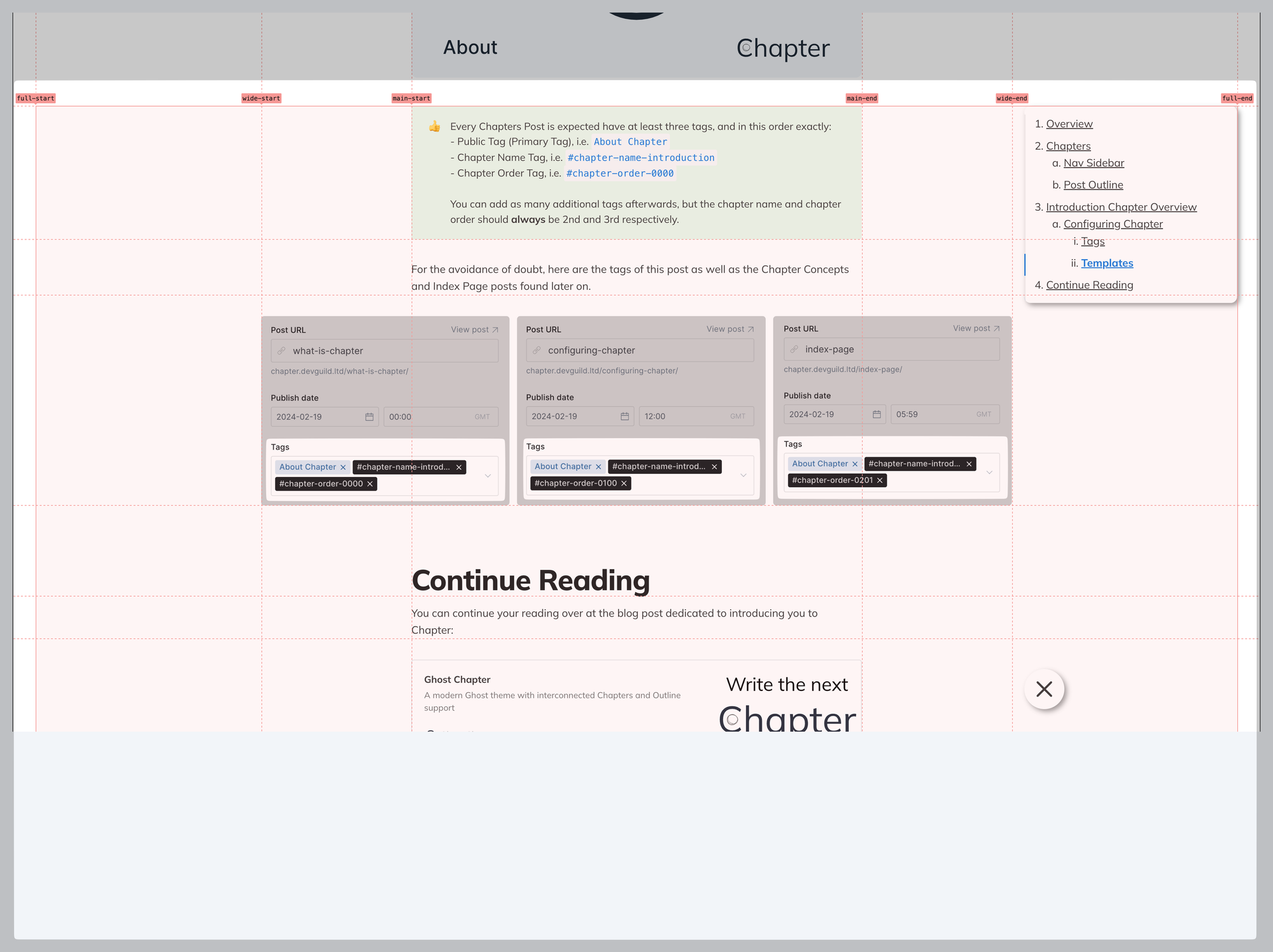
You can see that the Wide image takes up the entirety of the column from wide-start to wide-end.
In these scenarios the Outline will try to "hug" the right side of the Wide column with a small margin, meaning that Outline content will never overlap with Standard and Wide content.
It will, however, overlap with the Full content blocks, which is inevitable, and sill assume a position on top of them:
Additionally, the Outline Toggle icon, positioned on the bottom in this screenshot, will hug the same "right" side of the Wide column internally as the Outline itself, making it easier to reach and interact with.
This might be slightly clashing with the position of the outline itself but I believe this to be a slightly more optimal UX decision.
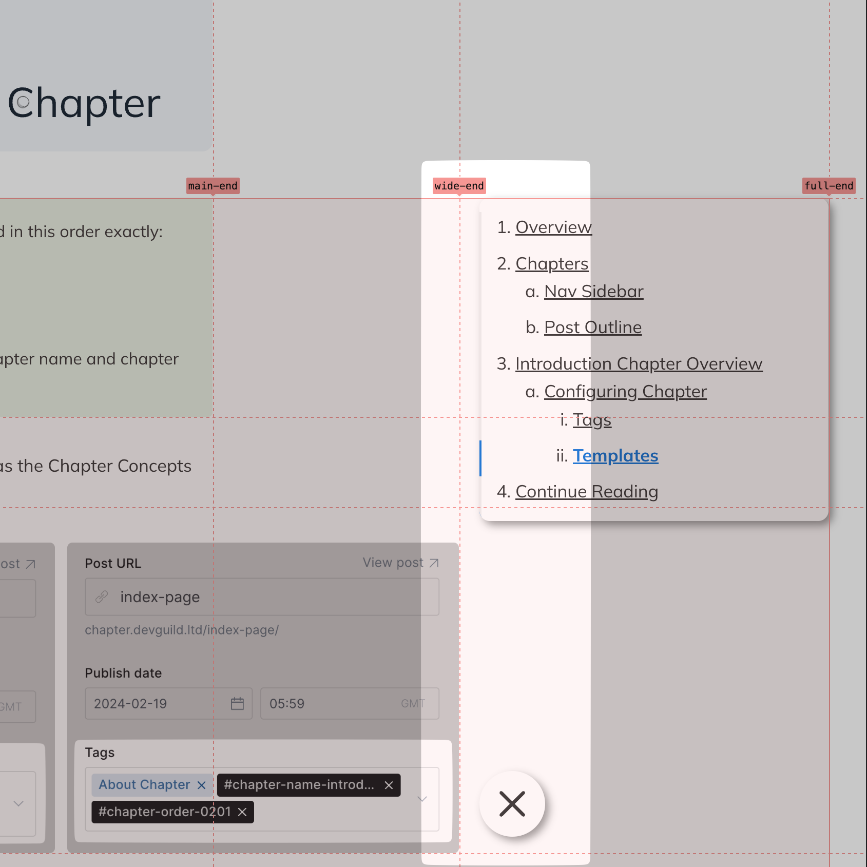
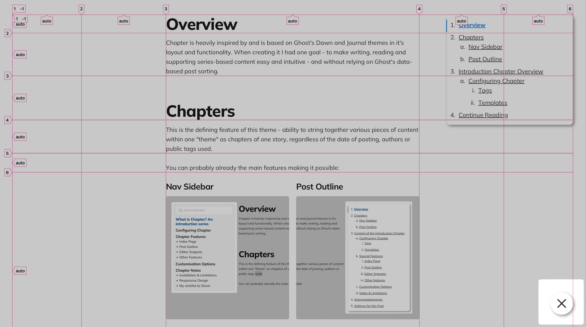
Medium viewports - 865px to 1991px
A rather broad range, within which the Outline is going to hug the very end of the container, anchoring itself to full-end.
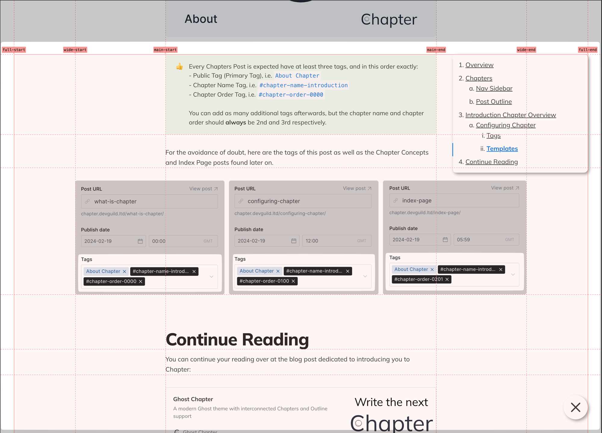
The Outline Toggle will follow suit, aligning itself with the right side of the Outline, providing a unified navigation experience that is visually aligned.
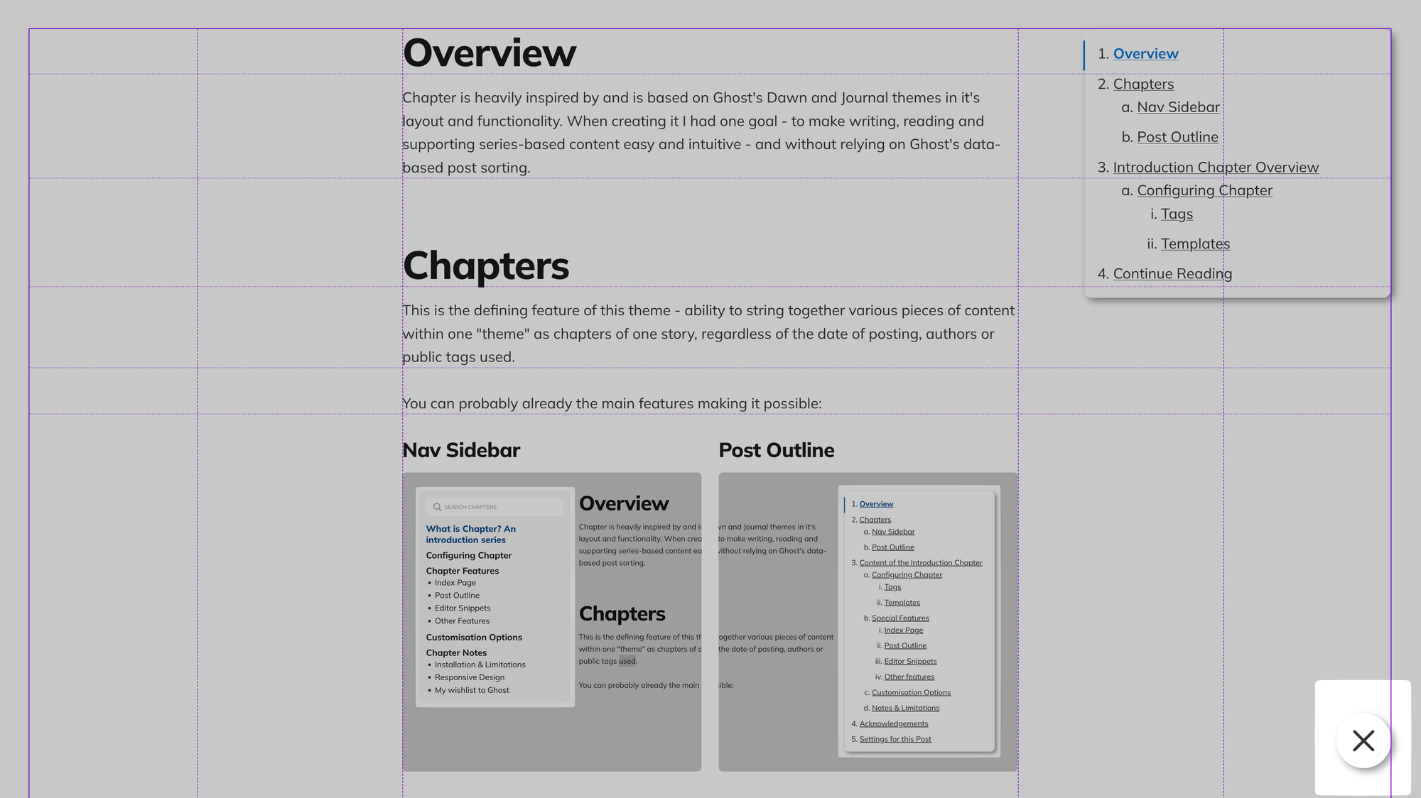
Small viewports - 864px and less
Once we're below the 865px mark, so 864px and down, the main, wide and full containers collapse into one, leaving the Outline and Toggle hugging the right edge of the container:
Unfortunately, on Safari and Firefox the Outline Toggle is going to always hug the far right part of the screen. This is due to the way WebKit and Gecko, the engines, handle the combination of
position: fixed and grid-column properties.This also applies to Chapter Templates.
Safari (WebKit) and Firefox (Gecko). Note that all browsers on iOS devices would be WebKit.
Chapter Templates
With the Chapter Templates having an full additional element the positioning becomes slightly trickier. Importantly, there are no significant differences between the Chapter Overview and Chapter Item templates, so the clashing is minimal.
Extremely Large viewports - 1512px and more
This is the most optimal viewport size for the Chapters theme, allowing for most content density with least overlap. With this, the Sidebar will be entirely contained between full-start and main-start and hug the main-start line, limiting it's maximum width to 360px, same as the Outline from the other side.
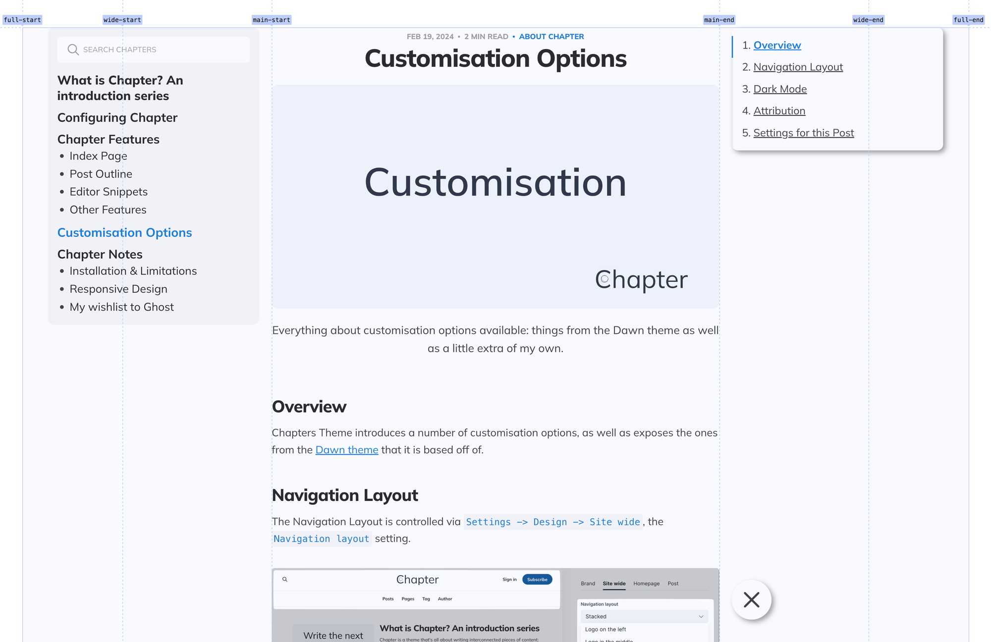
The Outline will hug the main-end from the right, never expanding beyond 360px width. Both will follow the main content, "sticking" to to the top of the page. The Outline Toggle will hug the main-end from the right, aligning itself with the Outline proper.
This approach clashes slightly with the bottom section (author, comments, etc) and makes it off-center, but provides the best readability and an equal view for all.
Large viewports - 1345px to 1511px
This is a narrow gap, but within it lie many of the most popular viewport sizes. In this mode, the Outline will "undock" from the main-end's right side and will instead start following full-end from the left, overlapping slightly with the content.
Medium viewports - 992px to 1344px
Within Medium viewports, the columns are significantly simplified down to two: before main-start and after it. Chapter navigation will continue to take up most of the left one, whilst content will grow to take up the entirety of what's remaining, with the Outline and Outline Toggle hugging the new full-end, equivalent to main-end
Small viewports - 768px to 991px
On these, the space taken up by sidebar is gradually limited to leave enough for the content, but otherwise it's identical to the Medium viewport:
Extra Small viewports - 767px and less
Lastly, for the extra small viewports, measured at 767px and less, the Sidebar moves over to the top and stays there but is collapsible and scrollable internally. The Outline continues to stay with the content, fixed to the screen:
Closing word
There are a lot of decisions that were made with regard to handling responsiveness. Leaving a single content column with no Wide or Full blocks and surrounding it with equally spaced Sidebar and Outline elements of equal width on larger screens, Outline overlapping content on smaller screens felt like the best way forward.
As always, I'm always open for feedback on how that might be improved in the future!
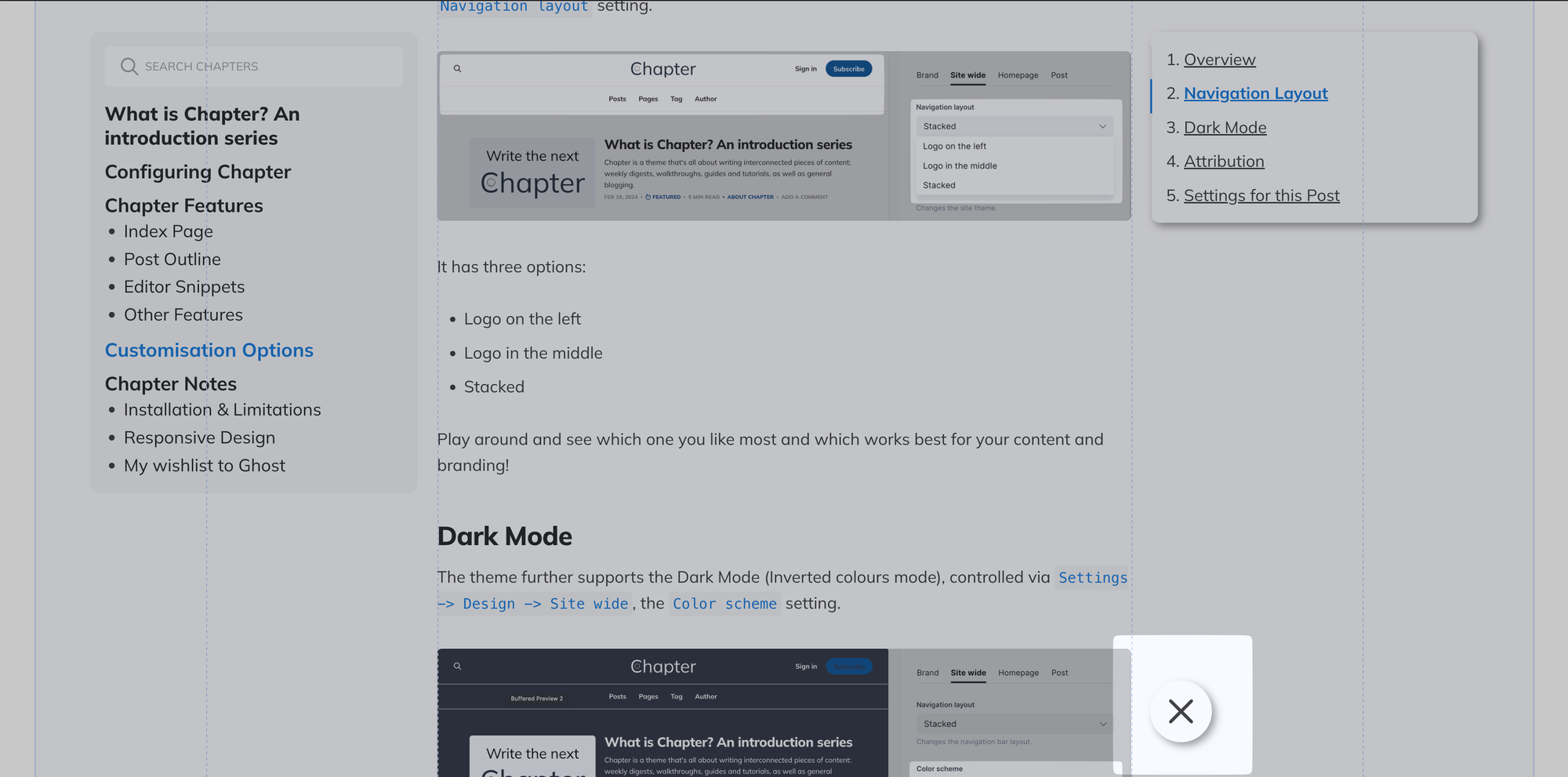
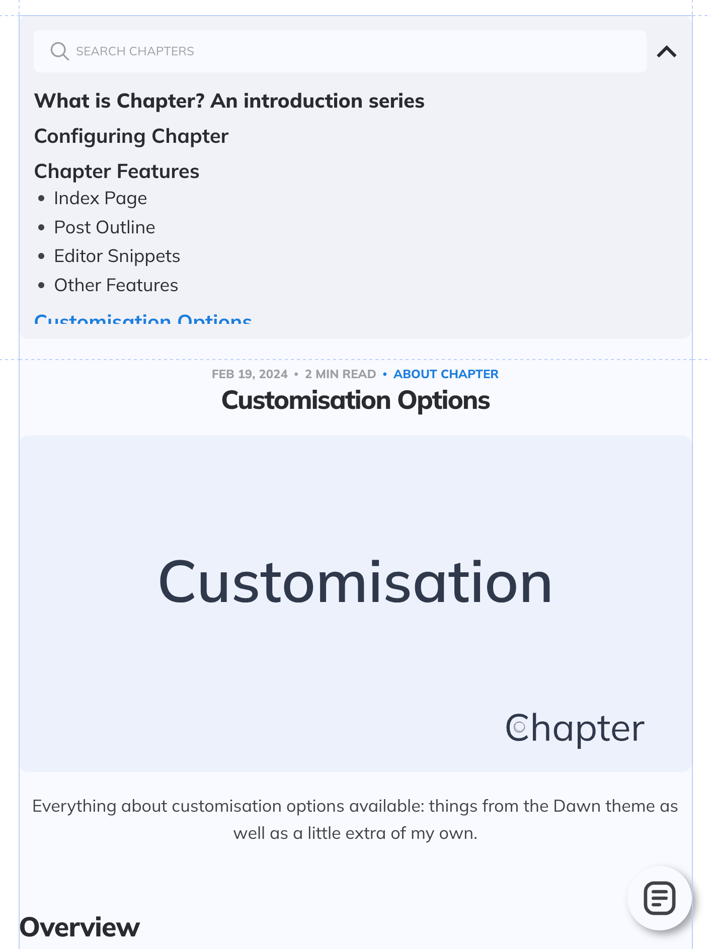
Settings for this Post
To help you with your Chapters journey I have attached this post's settings below so you could troubleshoot your configuration.
Member discussion